[Today’s memo from Roy H. Williams focuses on counter-branding. I’d encourage you to visit the example company’s website to see how it’s done. -dave ]
]
When your business category is dominated by a single brand and all the other brands put together don’t equal them, it’s time to create a counter-brand.
Counter-branding – business judo – is rare and dangerous. But when you’re overwhelmingly dominated, what have you got to lose?
Prior to the creation of their "Uncola" counter-brand in 1967, 7-Up had survived for 38 years as a lemon-lime soft drink with the slogan, "You Like It. It Likes You."
Yippee Skippy call the press, a soft drink likes me.
As in Judo, the secret of counter-branding is to use the weight and momentum of your opponent to your own advantage. In other words, hook your trailer to their truck and let them pull you along in their wake.
The steps in counter-branding are these:
1. List the attributes of the master brand. In the case of 7-Up, the master brand was "Cola: sweet, rich, brown." Everything else was either a fruit flavor or root beer and all of those put together were relatively insignificant. "Cola" overwhelming dominated the mental category "soft drinks."
2. Create a brand with precisely the opposite attributes. To accomplish this, 7-Up lost their lemon-lime description and became "The Uncola: tart, crisp, clear."
3. Without using the brand name of your competitor, refer to yourself as the direct opposite of the master brand. 7-Up didn’t become UnCoke or UnPepsi as that would have been illegal, a violation of the Lanham Act. But when you’re up against an overwhelming competitor, you don’t need to name them. Everyone knows who they are.
Let’s look at a current example: Starbucks. Notice how I didn’t have to name the category? All I had to say was "Starbucks" and you knew we were talking about coffee. That’s category dominance.
In the February 2005 issue of QSR magazine, Marilyn Odesser-Torpey writes about Coffee Wars, opening with the question, "Starbucks will certainly remain top dog among coffee purveyors, but who is next in line?" A little later we read, "Many of the competitors in the coffee segment are Starbucks look-alikes; if you take the store’s signage down, it would be hard to tell the difference."
Traditional wisdom tells us to (1.) study the leader, (2.) figure out what they’re doing right, (3.) try to beat them at their own game. This strategy can actually work when the leader hasn’t yet progressed beyond the formative stages, but when overwhelming dominance has been achieved, as is currently the case with Starbucks, such mimicry is the recipe for disaster. Are all competitive coffee houses forever doomed to occupy the sad "me-too" position in the shadow of mighty Starbucks? Yes, until one of them launches a counter-brand.
To determine what a Starbucks counter-brand would look like, we must first break Starbucks down into its basic brand elements:
1. Atmosphere: quiet and serene, a retreat, a vacation, like visiting the library. Bring your laptop and stay awhile. They’ve got wi-fi.
2. Color Scheme: muted, romantic colors. Every tone has black added.
3. Auditory Signature: music of the rainforest, soft and melodious
4. Lighting: subdued and shadowy, perfect for candles or a fireplace.
5. Pace: slow and relaxed. This is going to take awhile, but that’s part of why you’re here.
6. Names: distinctly foreign and sophisticated. Sizes include ‘Grande’ and ‘Venti.’ (No matter how you pronounce these, the ‘barista’ will correct you. It’s part of the whole Starbucks wine-bar-without-the-alcohol experience.)
Counter-brands succeed by becoming the Yin to the master brand’s Yang, the North to their South, the equal-but-opposite ‘other’ that neatly occupies the empty spot that had previously been in the customer’s mind.
Here’s what a Starbuck’s counter-brand would look like:
1. Atmosphere: energetic and enthusiastic. Running shoes instead of bedroom slippers. Leave the car running because we won’t be here long.
2. Color Scheme: bright, primary colors such as are found in athletic uniforms, against a background of white or off-white.
3. Auditory Signature: anything with a driving beat, faster than a resting heart-rate. Dance music.
4. Lighting: dazzling, like in a sports arena.
5. Pace: driven by the music, on the move. Caffeine!!!
6. Names: straightforward and plain. Descriptive, rather than pretentious.
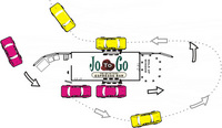
HOW IT MIGHT SOUND ON THE RADIO: Most people think to get a fast cup of coffee you have to settle for fast-food coffee …or worse…convenience store coffee. And to get a good cup of coffee you have to stand in line for 20 minutes at some snooty coffeehouse where things can’t just be medium and large, but have to be ‘Grande’ and ‘Venti.’ At JoToGo we serve really good coffee, really fast. We’re the original drive-thru espresso bar serving all your favorite premium coffee drinks at lightning
speed. So when you’re on the go, get a JoToGo. No snooty attitude here, just fabulous coffee fast
.
No matter how big a brand might be in the public’s mind, there’s always an open spot for the exact opposite. When the circumstances call for it, be that opposite. Create a counter-brand.
Roy H. Williams
PS – JoToGo is a real company – a new franchise – and they’re doing fabulous.
PPS – The cognoscenti will recognize the techniques used in counter-branding as a practical application of Thought Particle theory.

Interesting idea. Another great example is/was Avis Rent-A-Car. During the 60s they took on Hertz, at that time the dominant brand, with “If You’re Number Two, You’ve Got to Try Harder.” It worked really well.