
iPhone drive-by photos of two coffee shops in my town. They are 1 block apart.
UPDATE: I drove by the Black Mug yesterday (9/17/09) and they are now out of business.
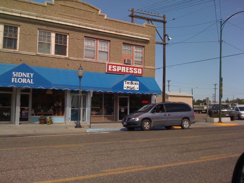
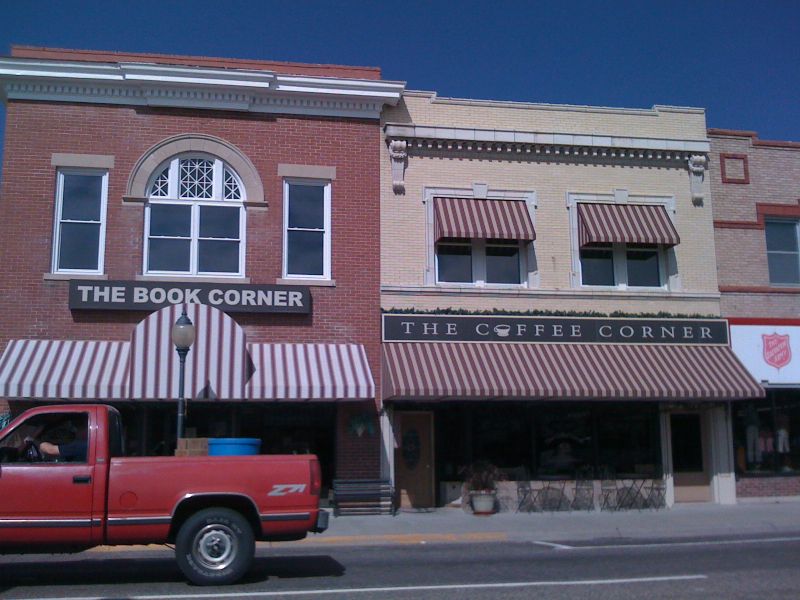
What are the assumptions you make just by looking at the outside of the shops?
Which one are you more likely to invite a friend to?
Which one do you think has a more pleasing ambiance?
Which one has higher prices?
Which has the best coffee, or the best treats to go with the coffee?
Though, when it comes to coffee, that too with an eye candy, I don’t see how the place is. But for now, I will keep my eyes on the second one..
Interesting question. The second one looks more upscale given the awnings and the brand. However this positioning is diminished somewhat by the adjacent retailer – Salvation Army. The first one touts espresso, but the brand signage is pretty weak. Overall the 2nd one signals higher prices, better coffee and a more pleasant environment.
Don’t let the Salvation Army location fool you. This town is so small, there really is no upscale/downscale area. Your assessment is dead-on. My point is, that not knowing anything about either place, you’d probably be more likely to trust the “upscale” store.
I have it on good authority that the Black Mug has a killer breakfast burrito…but I’ve never even been inside.
Good signage and good location are a much better use of an ad budget than efficient schedules and good copy.
I think these pictures illustrate the point.
Both have retailers that they should incorporate into their business. (Flowers and books) Both make for great additions to a coffee shop. Arrangements in the windows and signs offering reading material could help both businesses
This is strange…and interesting. I would actually choose the first location. Wasn’t sure why at first, but I think now, the second one looks upscale, but also looks generic, so I don’t see a huge reason based on the visual identity alone to choose this one. The photo makes it look empty. The photo is also more muted in the second and not as bright and cheery as the first.
Also, the first has a lit sign in the window and seems more like a home-grown kind of brand that I could get something really different or special from. I am more attracted to indy restaurants and shops than to chains, though.
Weird. I’m actually a designer and so I’m pretty surprised by my choice.
UPDATE: I drove by the Black Mug yesterday (9/17/09) and they are now out of business.